So, you want your resume to stand out.
But will using color in your resume help increase your chances of getting hired, or will it turn potential employers away?
Once upon a time, using color on resumes were generally considered unacceptable. Fast forward to the present and the perspective of most employers has now changed. According to CNBC, most hiring managers will appreciate your creativity in using color on your resume. However, there are considerations to keep in mind.
And what about the resume color scheme you choose? Does it matter? The short answer is “yes.” The right balance of color will make your resume stand out and will help convey your personal brand. Also, the ways in which you use color on your resume will help direct attention. But when you use color on your resume randomly and without strategic thought your resume can have the opposite effect, looking gimmicky and giving hiring managers a negative impression. You must choose your resume color scheme thoughtfully.
The Positive Impact of Using Color on Your Resume
Using color on your resume provides you with an increased level of customization and can have a stunning positive impact on the results your resume produces. Some of the advantages include:
Stand Out & Gain a Competitive Edge
Best Practices of Using Color on Your Resume
Are you considering adding color to your resume? It is important to remember that color choices have consequences. Color affects perception and in the context of a resume color can really impact the first impression your resume makes.
Colors convey different emotions and they influence what we think and how we feel. Bright colors, for example, make a very different impression than a more muted color palette. As already mentioned, color can also direct our attention. On your resume, this means that the careful use of color can help draw attention to points you want to emphasize and also draw attention away from points you want to deemphasize.
Here are a few ways that you can effectively use color in your resume:
Create a standard black-and-white resume
If you’re at all unsure whether you want to use color on your resume or wonder if some employers might not be impressed by color, it is a simple process to create multiple versions of your resume with different color schemes, including a black-and-white version.
You can show these versions to trusted friends and family, to solicit their opinions on the colored versions vs the more traditional black-and-white version. And, if you are applying for a job at a company with a very conservative culture and you think the basic black-and-white version will be best, you’ll have it ready.
Choose a color scheme
Use a consistent resume color scheme to ensure you use colors attractively and professionally. To do this, it is usually best to use no more than three colors – primary, secondary, and accent colors.
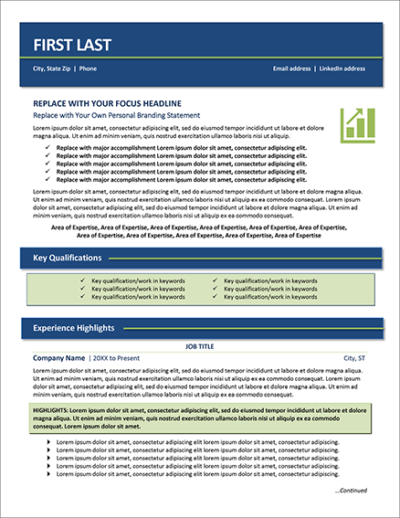
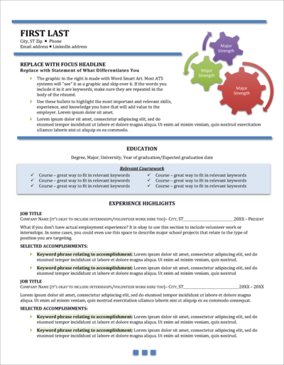
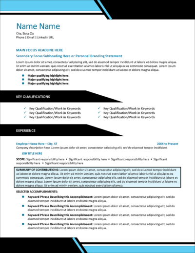
For example, you can use black as the primary color, blue as the secondary color, and green as your accent color. You can also create a very attractive resume using a monochromatic color scheme, for example two or three different shades of blue.
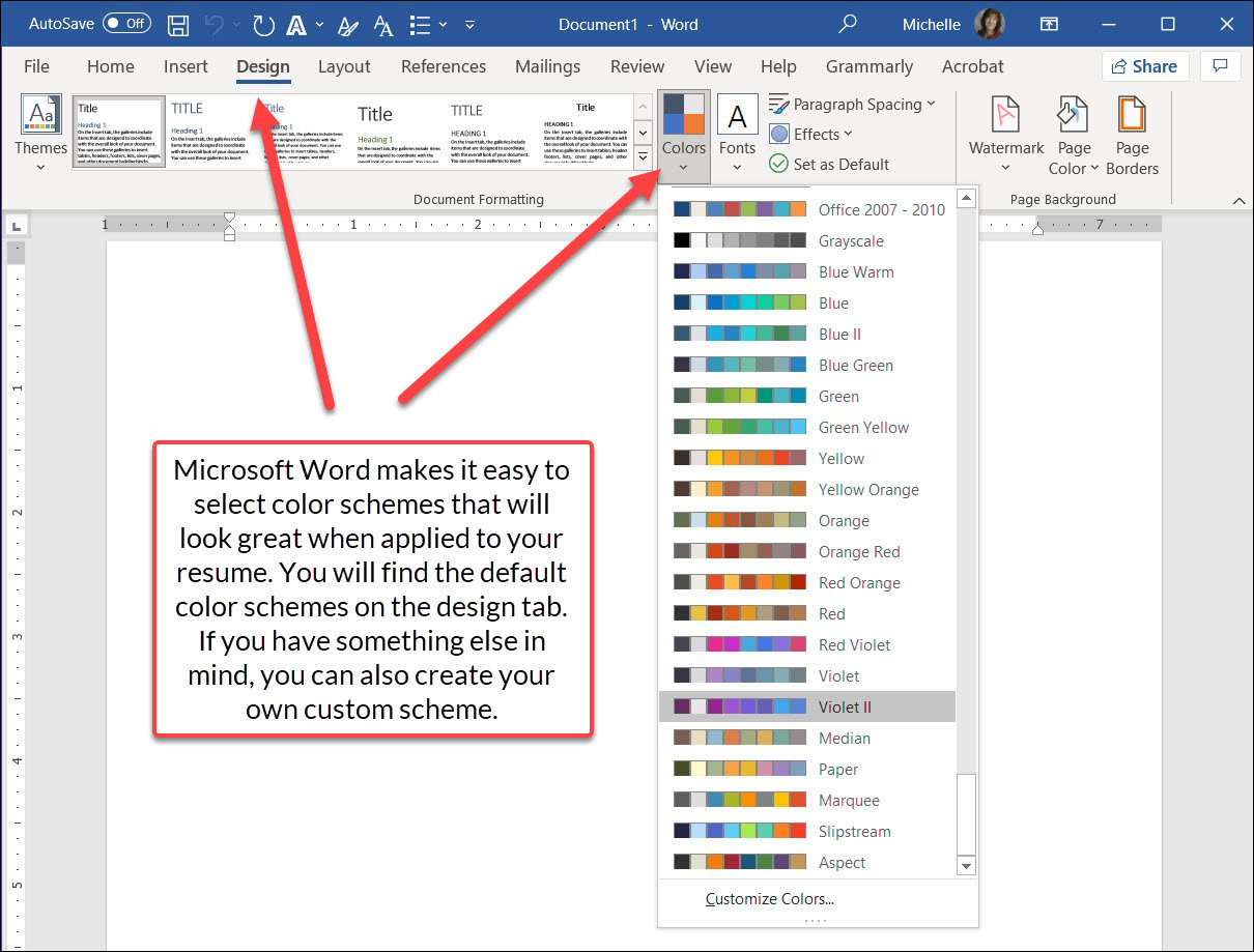
Microsoft Word makes it easy to create attractive color schemes by selecting from the pre-set color schemes with professionally selected complementary colors. You will find these on the design tab, under colors. If you want to edit your resume color scheme, simply choose another of the pre-set color palettes. Always preview your resume to ensure the colors work well together and make any necessary adjustments.
Unless you are intentionally trying with your resume design to draw the eye to a section of text (such as a heading), it is usually best to use only black or shades of gray for the text of your resume.
Don’t just pick any color
What colors will look best in your resume? The choices you make about color are important because color helps to reflect your personal brand and can even help tell your story. Don’t just choose any color and pray that the hiring manager has a similar taste to yours. The colors you choose will evoke feelings and create an impression, and you should be thoughtful about exactly what image you want to convey.
For example, blue is generally accepted to convey brand attributes like trustworthiness, competence, and responsibility. Green conveys money, revitalization, and nature. Orange, creativity, productivity, and an adventurous spirit.
To pick the right colors for your resume format, think about the context of the job you’re applying for, the expectations of your target industry and profession, the theme of the success stories you are telling in your resume, and the brand image you want to convey.
For example, imagine that you are an accountant or finance professional who is bold, confident, and ambitious and approaches every responsibility with a sense of urgency. These brand traits would tend to point to using the color red in the resume. But is red really the best choice for the accounting profession? A corporate finance executive? I’d say no. I would probably choose a green or a blue instead that convey the traits more valued in an accounting or finance professional.
Or, maybe you are known for bringing new energy and ideas and infusing your workplace with positivity. Or maybe you work the solar industry. Perhaps oranges and yellows would be good choices in either of those cases.
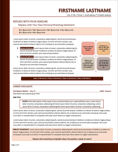
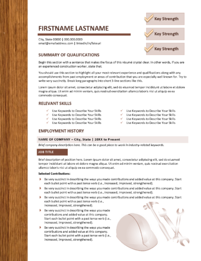
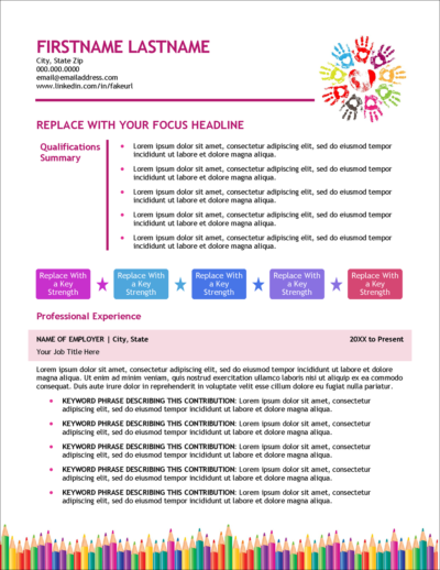
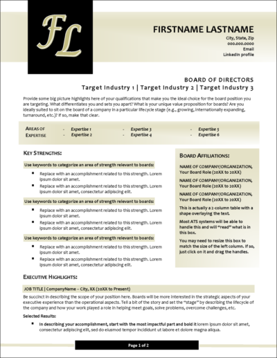
Here are a few examples. Imagine how different the first impression would be for these resumes with a different color choice.
The best colors for your resume are sometimes those that represent your profession. The wood-tone browns are perfect for this construction resume template.
A light color palette, such as these pastel pinks and blues, is perfect for this early childhood education resume template.
While other colors could work too, the gold and black shades in this executive board director resume template make a striking image.
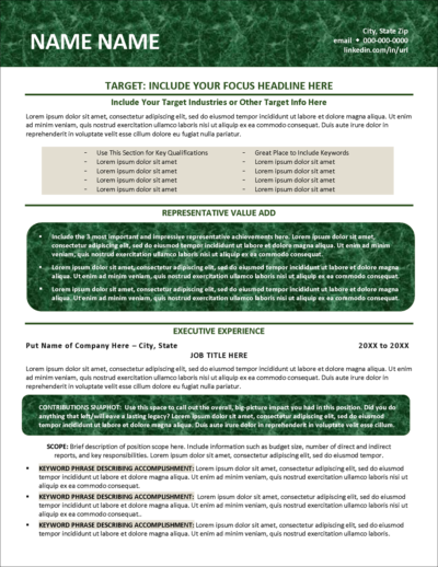
The dark green of this template provides a rich-looking color palette, making it especially well suited as a finance professional resume template.
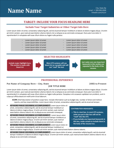
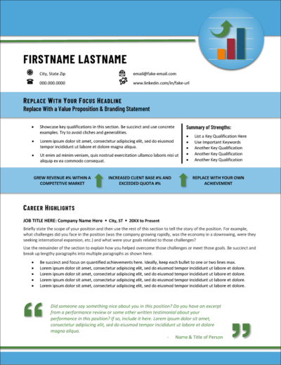
Bright colors can provide bold contrast that gets the attention of hiring managers. The bright blue combined with the bold red and green color choices are perfect in this sales resume template.
See the infographic at the end of this article for more about color psychology and some guidelines for choosing the best colors for your situation.
Should You Use a Colorful Resume Template When Creating Your Resume?
The simple answer is yes.
In fact, I’d argue that rather than focusing your attention on whether or not to use color, you focus on how you will incorporate color and which color palette you will use.
As discussed above, there are some fundamentals that you should first understand to help you choose the right resume color for your job target.
If you are not confident designing your own resume and selecting colors that look good together, using a colorful resume template from Distinctive Resume Template will be of great help. Even better, you aren’t stuck with the template color scheme. You can easily change the color scheme of almost all of our templates by just clicking a few buttons.

Frequently Asked Questions
Should I use color on my resume?
Yes, using color on your resume can help it stand out and convey your personal brand. However, it’s essential to use color judiciously and ensure it complements your resume content rather than distracts from it. The key is to strike a balance between aesthetics and professionalism.
What is the best color scheme to use on my resume?
The best color scheme for your resume depends on your industry and the image you want to project. Neutral colors like navy blue, gray, and black are universally accepted and convey professionalism. Shades of purple, blue, green, or other colors can be used to highlight specific sections or headings. It’s essential to ensure that the colors you choose are easy on the eyes and maintain the document’s readability. Some colors or color combinations can look gaudy, jarring, or tacky, and these are not the impressions you want to leave on hiring managers. Be thoughtful and strategic about the color scheme you choose.
What is the impact of using color on a resume?
Color on a resume can make it visually appealing, showcase your creativity, and help you stand out from other candidates. Research shows that color increases attention and comprehension, so strategic use of color can direct a recruiter’s eye to important information.
Is color on a resume only for graphic designers or other creative fields?
No, while graphic designers and those in creative industries might have more leeway in using vibrant colors, candidates in all industries can benefit from using color on their resumes. The key is to use color subtly and in a way that enhances the resume’s overall appearance and readability.
How should color be used strategically on a resume?
Color on a resume should be used strategically to emphasize important points and deemphasize others. It’s usually best to stick to a consistent color scheme, using no more than three colors. Unless drawing attention to a specific section, use black or shades of gray for text.
Can color on a resume reflect my personal brand?
Yes, the colors you choose for your resume can help to reflect your personal brand and tell your story. Different colors can evoke different feelings and create an impression. For example, blue might convey trustworthiness and competence, while orange might indicate creativity and productivity.
Should I use a colorful resume template?
Using a colorful resume template can be a good idea, especially if you’re not confident in designing your own resume or selecting colors that look good together. It’s important to focus on how you will incorporate color and which colors you will use, rather than whether or not to use color.
Is it okay to have multiple versions of my resume with different color schemes?
Yes, you can create multiple versions of your resume with different color schemes. This can be helpful if you’re unsure about the use of color, or if you’re applying for jobs at companies with different cultures.
How does color psychology play a role in choosing the best colors for my resume?
Color psychology suggests that different colors evoke different emotions and impressions. When choosing colors for your resume, consider the job you’re applying for, the expectations of your target industry, and the brand image you want to convey. For instance, green might be a good choice for finance professionals, while creative roles might suit more vibrant colors.
Can using color in my resume make me seem more up-to-date on trends?
Yes, using color in your resume can convey the idea that you are a modern thinker who is up-to-date on trends. This can be particularly beneficial when applying for jobs in the creative field, but it can make a positive impact in any industry.
Is it professional to use a different color font on my resume?
Yes, it can be professional to use a different color font on your resume, particularly for headings or specific small sections such as company names or job titles. However, try not to choose colors that are not too bright or distracting. Stick to muted or neutral tones that complement the overall design of the resume and ensure that the text remains legible. The font used for your resume body text, such as your job descriptions or resume summary, is almost always best left black or dark gray as this is easiest to read, especially on a white background or other light background. Your goal should always be maximum readability.
What color paper should you print your resume on?
If you’re printing your resume, it’s best to stick to white or other light, neutral colors such as off-white paper. These colors are universally accepted and ensure your resume looks clean and professional. Colored paper can be distracting, especially if you have used color in your resume design, and might not convey the right image to potential employers.

